Wednesday, December 19, 2012

It's My Birthday, Too!


Happy birthday to the best twin sister ever!!

Time to party! It's my birthday! Best of all, I get to share my birthday with my beloved twin sister! Neat fact: I was born first so I'm four minutes older.

She and I are pretty much inseparable. We have the best friendship. No one knows me like she does. No one. Mr. M and I bought a house exactly 7 blocks away from her so we could be close by. She has the two best kids ever. I'm very blessed.

I must show you this card my 5 year old niece made for me. It's delightful! 

Birthday Card From My Niece (5)

Birthday Card From My Niece (5)

That's a picture of the two of us making art - with my gelli printing plate! She absolutely loved seeing a video of the gelli plate in process and begged me to help her make prints.

The text reads: "You are the best becase you let me bo progex."

becase = because
bo = do
progex = projects 

How cute! 

It took me a few long moments to figure out that last word! My niece reported it was too hard to make a "j" so she went with the "g". I'm actually a big fan of creative spelling for kids her age because they can still learn neat things about letters and words even with mistakes.

Birthday Card From My Niece (5)

I hope your day is filled with magic, too! 

- Vickie

Tuesday, December 18, 2012

Paper Roses Have No Thorns


I made paper roses! They have a little glitter on the edges.

My mom's birthday was last week. I always like to decorate her gifts so she knows how special she is to me. Plus she then gets some of my art! 

I made these roses out of plain copy paper soaked liberally with spray inks - I haven't figured out these spray inks yet. The edges of the roses have a little glitter on them. The color from the spray inks lifted when I put the wet glitter glue on, which resulted in the glitter colors matching exactly to the rose colors. Happy accident!

I added some loose fake leaves I had around, twisted them together in the back, and made curly-Qs with the stem ends. A little sparkly, sheer ribbon added a nice touch and allowed for tying the decoration to the gift.

To be honest, I was not expecting the reaction I got from my mother and twin sister about these roses. They LOVED them! The two of them immediately imagined many uses for them - from hair clips to wreaths. How lucky am I that I have the two best cheerleaders ever in my family for my work?!

(We were all gathered for The December Birthday Bash where we celebrate mom's birthday as well as my and my twin sister's birthday at one party. December just gets too busy with that many birthdays to party for.)

Mom has asked me to sew a little felt piece and a pin back to her gift decoration so she can wear it as a brooch!

Then my nieces (5 & 8) wanted some! They insisted on coloring their own if I would cut the roses and roll them. How could I say no - even though it was about 10 minutes to bedtime? 

The roses below were made by my youngest niece. The yellow yarn was her idea as she wanted to wear the roses in her hair. A heavier cardstock was used for these roses and you can see they end up a bit larger and fuller. 

Little Miss's Paper Roses

The roses are rather fun to make, and I imagine I will be developing a line of art to use them on. Maybe even some hair accessories and what-not. I'm intrigued by where these will take me!

- Vickie

Wednesday, December 5, 2012

In Which I Am Mentioned! Honorably, Even!


Honorable Mention at Artist Row 2012

I failed to post about Artist Row 2012? How did that happen?! Oh, yeah. That busy thing called LIFE. 

Artist Row 2012 was great. Tons of people showed up to look and shop. The Rochester Public Market is a fabulous venue in our city. It always draws the crowds! 

This was the first year I did this show even though this was the eighth (or ninth?) annual show. I didn't even know they gave awards until I saw several judges hanging around my booth. 

Then they walked over and gave me an "Honorable Mention" award! Can you believe it?! I still cannot believe it. 

This show is filled with the best artists in town - names that are well known in the big art circles - artists who show in the galleries - artists whose work I adore. And I am not in their league - no way, no how. 

Yet, they gave me an award. One of only 10 for the whole big show. How cool is that?! The award came with free booth fee to next year's show! Yay!

New Pendants! Artist Row 2012

These are new BINGO marker pendants, very vintage Anagram game pendants (these are from the 1940's), and a few mahjong tile pendants. 

Me & Half My Booth at Artist Row 2012

This is half my booth set-up with my domino pendants up front. That's me in the back, with my certificate. My mom made me pose for a bunch of photos with the thing. Way to make me feel like an elementary school girl - kind of fun, though! Thanks, Mom! 

Artist Row 2012

It was nice to do an outdoor show for once. The Public Market has wonderful covered space, and I didn't have to fuss with a real show tent. A friend helped me put up a small canopy just to keep the late day sun off my work.

I'm so looking forward to next year at Artist Row 2013! What a delight to feel I really earned my spot!  

- Vickie

Friday, November 9, 2012

"Put A Bird On It!" :: RNEST Challenge


Put A Bird on it RNEST Treasury NOTE

It's time for another Rochester NY Etsy Street Team Monthly Challenge! November's theme is "Put A Bird On It!", which is more in reference to the delicious and varied poultry we will enjoy on Thanksgiving than the current cute trend. 

Personally though, I love putting birds on anything. I adore little birdies. If I could be any animal it would definitely be a little bird!

The Party Bird :: Domino Pendant

My "Party Bird" domino pendant was created with ridiculously tiny, hand-cut pieces of paper that I painted myself. Even the little poofy part on top of the hat is hand-cut! 

Head on over to the Rochester NY Etsy Street Team's blog to cast your vote! You have until November 14th at midnight.

You can also head on over to In My Head Studios' Etsy shop to buy this dapper little fellow for yourself! 

- Vickie

Friday, November 2, 2012

Shop Small at Mayday Underground Crafts + Art


Be a part of something bigger by shopping small this Saturday at Mayday Underground Crafts + Art! This show features plenty of local, amazing artists who create hip and modern handmade goodies for all the people on your holiday shopping list. 

Shopping small is about supporting small, local businesses and artists for your holiday gifts this season. This actually does make a difference. A very huge difference! 
"The average American will spend $700 on holiday gifts and goodies this year, totaling more than $465 billion, the National Retail Federation estimates. If that money was spent entirely on US made products it would create 4.6 million jobs.  
But it doesn't even have to be that big. If each of us spent just $64 on American made goods during our holiday shopping, the result would be 200,000 new jobs." - ABC News
I have been working in the Rochester area for over 12 years doing my art thing. I personally have pumped an untold amount of money into the community during this time by buying my supplies locally and spending my profits on handmade goods over and over again. So, by supporting me you are actually supporting many, many local artists and businesses. You can't lose! 

When it comes to shopping small, you can't get any smaller than with Tiny Works of Awesome from In My Head Studios! I make ridiculously tiny original artwork on the backs of dominoes and other game pieces. So shop small by shopping even smaller!

Saturday, November 3, 2012
10:00 AM – 5:00 PM
The Main Street Armory
900 East Main Street, Rochester, NY 14605

The first 50 shoppers through the door get FREE swag from the artists in the show! How cool is that?!

- Vickie

Saturday, October 13, 2012

Holiday Craft Show Schedule 2012


Holiday Craft Show Schedule 2012
Time to get your handmade holiday shopping done! I'm here to help with Tiny Works of Awesome from In My Head Studios

Want to know where I will be vending? Here is a handy list! Or you can print the above image to keep in your calendar, pocket, purse, or file of awesome things to not miss out on. 

Since I don't have a lot of work listed in my Etsy shop, these shows are the only places to get your Tiny Works of Awesome this season! Don't miss out!

I will update these listings as Facebook event pages become active so you can invite your pals.

Next week kicks it all off! See you at St. Rita's!

Saturday, October 20, 2012
9:00 AM – 3:15 PM
St. Rita School
1008 Maple Drive, Webster, NY 14580
--------------------------------------------------
Thursday, November 1, 2012
10:00 AM – 7:00 PM
* Plenty of time to shop after work! *
Casa Larga Winery
2287 Turk Hill Road, Fairport, NY 14450
--------------------------------------------------
Saturday, November 3, 2012
10:00 AM – 4:00 PM
Main Street Armory
900 East Main Street, Rochester, NY 14605
--------------------------------------------------
Saturday, November 24, 2012
Irondequoit High School Craft Sale
10:00 AM – 4:00 PM
Irondequoit High School
260 Cooper Road, Irondequoit, NY 14617


- Vickie

Friday, October 5, 2012

Now With 100% More Fiber: Show Opening Tonight!


"Feathers" The Scrappy Bird

As you well know I am first and foremost a paper artist even though a lot of my work ends up being many mixed medias. One medium, however, has always stumped me. 

Fiber. Fabric. Sewing. 

All Greek to me. 

Occasionally I might delve into the world of fiber for a small piece of some other work - a stitch here or there. But it's never the main ingredient. 

Something about that has bothered me of late. There is a frontier yet unexplored. My internal mad scientist cannot deal with frontiers left unexplored. So I am driven to follow the road down to that horizon and see what's there!

With me on my journey is one of my favorite people and artists of all time - Leslie W. at the Creative Wellness Coalition (CWC). Her work with fiber is astonishing. She has the capacity to mold and shape the seemingly ethereal qualities of fibers and fabrics into works so fanciful and amazing that she blows my mind on a regular basis. 

With Leslie's help I was able to create four fiber pieces that are included in the show that opens tonight. Creating these pieces over the course of the past three weeks has changed my way of thinking about fiber and fabric. They are not such a mystery now. I've innovated myself into a place I simply must keep exploring. I love this fiber stuff!

The opening tonight coincides with First Friday here in Rochester. This is an event where most of the galleries and artist studios in the ArtWalk/Neighborhood of the Arts area are open. So much to see and do on First Fridays! 

Please join me at The Creative Wellness Gallery tonight! 

"A Celebration of Fiber Arts" 
by Various Artists

Opening Reception
Friday, October 5, 2012
6:00 PM - 9:00 PM

Creative Wellness Coalition
320 N Goodman St
Rochester, NY 14607
(585) 325-3145
Right next to Village Gate in the gray building with red window trim


- Vickie

Saturday, August 4, 2012

Bring On the Monks!


Monks! The Drepung Gomang Monks are in town! 

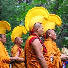
All the way from India and exile from Tibet. 

Right here, in Rochester, NY ... my hometown ... where I am lucky and thankful to not live in exile from my people, my culture, and my choice of religion. 

They are here to pray for healing and compassion. They are here to celebrate life and the amazing, wondrousness of it all. 

Most of all they are here to let us know our suffering does not go unheeded or without love and empathy. Unconditionally. From all four corners of the earth and beyond.

I'm over-the-top excited about this. Not only because I get a chance to see them make a sand mandala and hear them chant three chords at once, but because the Drepung Gomang monks are visiting a place near and very dear to my heart - The Creative Wellness Coalition

From 2000 - 2007, I worked there as the Impressions Gallery Curator (at what was then called the Mental Health Coalition, lovingly known as "The Coalition"). Now known as the Creative Wellness Coalition (CWC), the CWC is a non-profit, peer-run organization (meaning all staff has a personal experience with mental health issues) dedicated to helping people with mental illness live full lives. 

The gallery I curated exclusively exhibited and sold the artwork of individuals with mental health issues. That gallery was my heart and soul, and the artists I was blessed to represent are all amazing people with amazing stories of triumph through and over suffering. 

I cannot imagine a better place in town to have a giant celebration of healing, understanding, and most of all, compassion towards ourselves, each other, and this place in which we all must live together. 

Several of the events of this amazing visit have already occurred. I'm not on the ball with this post (or much else this past week with all the migraines). I guess I need some healing compassion of my own.


Today, Sunday, and Monday from 9:00 AM to 4:00 PM the Drepung Gomang Monks will be building a sand mandala at the Creative Wellness Coalition. 

Click here for the schedule. 

Tibetan handcrafted merchandise from the Himalayas will be available for purchase. Bring a T-shirt and have it personalized with your name in Tibetan Sanskrit!

At 2:00 PM on Monday, August 6, 2012, the closing ceremony will begin. The monks will walk the sand from the mandala to the Genesee River in the middle of downtown Rochester. To symbolize the impermanence of all that exists, the colored sands are swept up and poured into a nearby river or stream where the waters carry the healing energies throughout the world. 

On Tuesday, August 7, 2012, there will be a Traditional Tibetan Soup Dinner at the Danforth Community Center, 200 West Avenue, Rochester, NY 14611. Monks and teen leaders will prepare soup in the afternoon and serve to the community beginning at 5:00.  Seating is first-come basis.

That's right! The Creative Wellness Coalition has everything from soup to monks! (Sorry. I couldn't resist.)

With that horrible pun (that will be making me giggle for a few hours at least), I leave you to cross everything else off your calendar for the next few days and go hang out with the monks. Yeah, I know Park Ave Fest is going on. The CWC is just a few blocks up N Goodman St from there! Anyway, it's over 95 degrees today. Go to the CWC where it's cool inside!

I'm hoping to spend much of Sunday there! Join me and let's share some loving kindness. And lots of hugs!

320 N Goodman St
Rochester, NY 14607
--> THE SCHEDULE <--

For more information call 585-325-3145 x 144

- Vickie

Saturday, July 28, 2012

Midsummer Mini Mayday Craft + Art Show


Did you hear?! It's time for a Midsummer Mini Mayday Craft + Art Show! Yippee!

The creators of the now famous Mayday Underground Craft + Art shows here in Rochester decided November was waaaay too long to wait to bring you more indie crafty goodness. 

Say "Yay for Midsummer Mini Mayday!" 

No, really. Say it. It rhymes. :)

If you are one of the 20 first shoppers through the door you get a FREE swag bag filled with goodies from the fantastic vendors! 

I'm up to my head in Mini Mayday swag!

There is swag from me at In My Head Studios! I made handmade, tiny, original paper collage domino keychains! How cute are these?!

They are truly one-of-a-kind and Tiny Works of Awesome! I made them with my own handmade stamps, handpainted paper, and words from books. Right now only 20 of these exist so snagging some swag from me will be special!

Here are the details:

Midsummer Mini Mayday!
Saturday, July 28, 2012
10 AM - 4 PM
The Decibel Lounge
45 Euclid Street
Rochester, NY 14604
Plenty of free parking!!

Just over 20 of the most creative, indie artists and designers in Rochester will be there! I'm excited to see my crafty pals! 

I better see YOU there, too! 

Happy Saturday! 


- Vickie

Friday, July 13, 2012

LOVE: Index-Card-A-Day 2012: 6/28/12


"LOVE" : #icad2 for 6/28/12 :: 2

For so long I have been blown away by some scrapbook pages - the kind with the sort of minimalist use of space with a lot of design and embellishment in one area around the photo. Particularly the work of Finnabair makes my brain pop. It's amazing, and I would love to speak to this artist about her work. 

After several attempts at this type of collage, I had kind of given up on getting it how I wanted. But I am not one to give up that easily. So I studied her work and the work of her peers. I studied the composition, layers, and colors. I deconstructed the pieces in my head and put them back together.

Of course this made for a good Index-Card-A-Day 2012 challenge. I'm trying NEW things for #icad2 and using up supplies I haven't even touched or have been saving forever. Time to open the scrap box...

"LOVE" : #icad2 for 6/28/12

... and pull everything out but the kitchen sink! Here we have random book pages, tickets, a cardboard coffee sleeve, tags, baker's twine, staples, stars, old paper from books and ledgers, sheet music, a paper clip, envelopes, a money band, washi tape, canvas, embroidery trim, a star brad, hangtag packaging, and stitching. 

"LOVE" : #icad2 for 6/28/12 :: 3

I literally spent hours and hours fiddling, and that turned into about three days of pushing bits and bobs around to get this done. I simply had to walk away from it several times to clear my head. At one point, all of it finally "clicked into place" - the layers, the arrangement, colors, and textures. 

"LOVE" : #icad2 for 6/28/12 :: 4

A lot of this was experimentation. Not knowing where I'm going with something can be very freeing to me. I asked things of my paper punches that only a mad scientist would try. I added some collage. Then went to the sewing machine. Then to the paint, and on and on until basically I made a tour of my studio in supplies and paper ephemera. 

My goal was to use these things in an "as is" condition as much as possible. I love how the ledger paper holes look as a design element. The letters for "LOVE" are stamped on the edge of a vintage dictionary page; I wanted to preserve the red edges as well as take advantage of the natural patina of the old paper.  

"LOVE" : #icad2 for 6/28/12 :: 5

I'm happy with the result. Even more though, I am happy that I TRIED this. Even if it had turned out to be a total FAIL, I still faced the edges of my comfort zone with courage and smashed those barriers to smithereens. I cannot recommend anything more highly than getting off your duff and doing that thing which scares you most in your art. 

Just. Do. It.

It's just paper, after all. Right? 

Right.  

- Vickie

Tuesday, July 3, 2012

"Home Sweet Home" ICAD2 for 6/21/12


home sweet home :: #icad2 6/21/12

Ok, I might be making the Index-Card-A-Day Challenge a little more challenging than I hoped and/or planned. I've just been so inspired! I didn't realize my brain needed a little discipline to work on something everyday, and now I am hungry, hungry, hungry for art all the time. I LOVE this!

This card is from June 21, 2012. It definitely took me more than one day to do this. I'm not getting a card a day done -  and I gave myself permission to do that at the start. However, I do believe I am still benefitting from this challenge like crazy. If I'm not getting one card a day done then I am at least working on one (or two or three at a time) each day. AND THAT COUNTS.


"home sweet home" ICAD2 :: Words

This house, bird, and nest image is something I've worked on before in different formats - for domino pendants and ATCs. Now I felt it needed an ICAD2 work-up. 

I started by making a house shaped template that fit the index card. I cut the house out of another index card, pasted scrapbook paper over it, and added the tissue tape. Then I stitched around the edges on my sewing machine.  

The sky is layered torn dictionary pages secured with matte medium. I added some watered down blue paint then splattered really watery gesso over it. I left the torn edges because they reminded me of deckled edges on handmade paper. The edge was then shaded with a darker blue Copic marker. 

The lettering is hand stamped in red pigment ink - which I had to stamp a billion times because I always mess up the last letter and ruin it. It's matted with dark red cardstock. The edges are inked to "age" and soften them. 


"home sweet home" ICAD2 :: Bird

The bird and nest images are from flickr's collage images group. I love the detail and texture in these pieces. My printer went light on the ink for this printing - not sure why. I went back over the pictures with colored pencils to bring out the color more. The gleaming highlight in the bird's eye is a dot of white gel pen. I also highlighted the eggs with white gel pen. 


"home sweet home" ICAD2 :: Nest

After I adhered the bird and nest to the background it all looked very flat. I used colored pencils to shade around the bird and nest for some dimension. It really perked the piece up. I also ran a thin line of dark brown pencil to the very edges of the paper of the collage images to bring them out more. 


"home sweet home" ICAD2 :: Postage Stamp

Oh, how I love using foreign postage stamps in my collage! I have about 20 pounds of old stamps (anyone need any?). I chose this one for the color and the country of origin - France - so it would tie in with the tissue tape behind it that has French on it.  


"home sweet home" ICAD2 :: Back

The back of the index card has the stitching I did with my sewing machine. I love sewing on paper. I'm stamping the date the card is finished on the back. I should go back and add some more details to the information of the piece. 


"home sweet home" ICAD2 for 6/21/12
"home sweet home" Index-Card-A-Day2
Mixed media & paper collage on index card
3"x 5"
© 2012 Victoria Porter/In My Head Studios
This ICAD2 looks adorable on a tiny easel I found at the craft store! 

I am a bit behind on posting more ICADs that I have finished. There's much more to come!

- Vickie

Wednesday, June 20, 2012

What's On My Worktable? : Wednesday


What's On My Work Table Wednesday

It's Wednesday! Time to peek at my work table for "What's On Your Worktable Wednesday" over at The Stamping Ground blog

Today I am working on another Index-Card-A-Day (ICAD2). I'm going to use the red thread to sew around the house shape - which is my ICAD for today. The postage stamp, bird, and nest will be going on the house. For the buttons, I am still undecided. They sure do look good with the colors in the ICAD. Might have to get them into the design somehow.  

The paper covered spool is part of a gift for my bestie so I cannot say more about it just yet. :)

I just noticed in the photo that you can see the back of my scrap paper - an old unused coupon from my favorite craft store! Seriously folks, I recycle everything. 

Also of interest, the amount of space on my table shown here is pretty much all that is cleared off enough to work in. Hello, Six Inch Square Club

- Vickie

Sunday, June 17, 2012

Happy Father's Day : A Card


We are so blessed to have Mr. M's father in our lives. Father's Day has been hard these past two years since I lost my dad. But Mr. M's dad is such a wonderful guy that I'm grateful for the opportunity to celebrate him! 

Father's Day Card :: from Instagram

Most of the time when I start working on something I really don't have the "Finished Piece" visualized in my head. There may be parts of it or just a color scheme to begin with. For this card I was reaching toward handsome and manly. Mr. M's dad is an outdoorsman and enjoys fishing. So I went with earthy tones and unusual textures. 

I started with a blank piece of ivory cardstock, cut it in half, and folded it to make the card part. Using a foam blending tool I inked the edges of the card with some brown inks. Using two shades adds a lot of dimension and is worth taking the little bit of extra time to do so. 

Next up was my choice of papers. Pretty much went all out brown on this one. Using that large of an area of bold vertical stripes was stepping out of my comfort zone. I like swirly backgrounds. But for a guy simple and stylish is the way to go. I distressed the edges heavily. Even tore some off to make it look really tattered. Then I inked the distressed edges to, once again, add more dimension. 

At this point a plan does need to begin forming. I pulled out a couple scraps of paper and moved them around the face of the card until it looked pleasing, and I could decide where I was going. Eventually I chose a strip of map paper, a dark brown cardstock, paper that looks like burlap, and the sentiment printed from my computer that I designed in a font that looks like tire treads meets tweed meets stenciled lettering. How manly is that?!

Father's Day Card :: Sentiment Detail

I wanted a layered look so I put the strip of map paper between the two mats for the sentiment. That helps tie the elements together. 

When deciding to use my sewing machine on cards I find that if I don't really have a solid plan from here I mess the stitching up. Or sew the card itself shut. (Come on. Don't act like that never happened to you.) 

First I adhered the map strip to the dark brown cardstock with the dark brown behind the map paper. Then I adhered that to the card. Time for the sewing machine! 

Sewing Mr. M's dad's Father's Day card.

I stitched all the way around the card twice and then ran border stitches along the map strip edges. On cards like this where distress is good neatness doesn't count. I wobble the line a bit. It's more interesting. 

I glued the sentiment to the burlap paper and then glued that down over the map strip and stitching. See how planning ahead on the stitching prevented me from sewing through the sentiment? :) 

(Can you tell I'm not a seamstress? 99% of the material put through my sewing machine is paper. I think the only fabric I stitched was my craft show tablecloth hem.)

Father's Day Card :: Button & Map Strip Detail

I love using buttons on cards, and for guys it's especially appropriate. I chose an assortment of brown buttons from my extensive stash. Whenever I use buttons I pretty much always add thread through the holes so it looks like it is stitched to the card. Buttons on my cards without thread look "unfinished" to me. Again since I was going for a distressed look neatness didn't count and I left some straggly threads hanging on. 

I adhered the buttons to the card using Glossy Accents. I did so because it is wicked strong at holding 3D embellishments, and it dries quickly. Regular white craft glue would take hours to dry in that situation. This took 15 minutes. Joy! 

I thought at this point I might be done, but there was this big blankness in the bottom right corner. It looked unbalanced. I had to come up with something to put there. Digging through the piles of paper options on my messy work table I came across a coffee shop cardboard cup sleeve that had been striped down to the corrugated inside part. Texture! And brown! Perfect!

Father's Day Card :: Hero Flag Detail

I'm in love with bunting and banners of any sort right now. I thought this corrugate would make a cute flag. I trimmed it down to size and clipped the end to make points. The edges were inked in a dark brown and a little black. A tiny voice in my head wondered what this would do if I ran it through the sewing machine. Hmmmmm. Tiny Voice, you may have a good idea! 

I tested it on a small bit of scrap corrugate. The heavy flattening power of the sewing machine foot smushed the wavy texture down. But it was usable by bending it back into shape. Then I stitched the one for the card. 

The card still didn't seem finished at this point yet. Hmmmmm. What to do? What to do? 

DYMO! A solid go-to when stuck! I punched out the word "hero" and then used a regular 1/4" hole punch to pop out the letters so they would fit my flag. I glued them on lined up with the stitching. 

I have a thing for using odd numbers of items in my design. "Hero" is four letters. Gah! It had to be balanced out so I added the three hearts. Ahhh. My OCD is calmed.

Father's Day Card :: Bow Detail

The spot where the flag met the seintiment mats looked stark. Another solid go-to for masculine cards is raffia. It's a good, natural material to get away with making a bow not look too foofoo. And, yes, I did ink the raffia a bit to make it look old. Once again, the Glossy Accents is the glue to use for sticking raffia bows to cards.

I'm wishing ALL the daddies out there a very Happy Father's Day!! I don't care how tough and gruff you are. If a two year-old hands you a toy phone, you answer it! :) xoxo

For the rest of you, have a shiny, sparkle filled Sunday!

- Vickie

Saturday, June 16, 2012

Butterfly: Index-Card-A-Day for June 10, 2012


today's index-card-a-day. #icad2

“Experience is not what happens to you. It’s what you do with what happens to you.”

Rochester in the spring is lush lush lush. Flowers, trees, and everything else are blooming and verdant. It’s like the Garden of Eden around here lately complete with budding raspberry bushes right next to my driveway. 

The colors in the Spring 2012 Distress Ink palette were calling to me amidst the yellow, teal, and lavender of my neighbors’ gardens. 

I’ll admit I'm a newbie when it comes to working with Distress Inks. I’m an old-school stamper and still prefer my pigment inks for their brightness and colorfastness. As a mixed media artist I rarely plan which medium will be next in my work, and I often have to plan for something wet – like watery paint, matte medium or Mod Podge – to be spread across all or part of a piece. Using inks that are water-reactive like Distress Inks have only led to heartbreak learning this lesson the hard way. Bleeds. Smears. Oh, and tears.* 

So I’ve shied away from them. However, I must admit that I adore the color palette of the whole line and the amazingly inspiring Tim Holtz. I figure I better learn how to use them properly since I bought several pads. 

So I goofed around with them on my Index-Card-A-Day for June 10th! If I messed it up – it’s JUST an index card (plus hours of work – but, hey, that’s part of the artistic process, right?). 

I started out with the colors Squeezed Lemonade, Peacock Feathers, and Shaded Lilac. Using a foam blending tool I shaded the index card starting with the yellow, then on to the teal, and then the lilac. The yellow and teal blended to make a lovely greenish color. The teal and lilac made a shade of blue like the sky at twilight – an impossible ultramarine blue. The lilac ink wasn’t quite as dark as I wanted so I added some Dusty Concord. 

The butterflies were stamped with Peacock Feathers ink to keep the color scheme balanced. I inked the text stamp behind the sentiment with both Peacock Feathers and Shaded Lilac being careful to not get too much ink contamination between the pads. I wanted the text to blend in with the two colors I already laid down. That worked way better than I thought it would. These inks were beginning to score + points at this stage. I even splattered some water on the background to take advantage of the effect that creates. 

Butterfly for ICAD2: June 10th

To make the 3D butterfly I inked part of an index card scrap with Squeezed Lemonade to match the background. Then I stamped the same butterfly in Peacock Feathers and cut it out. Using my extra sparkly gel pen I drew in lines and dots on the wings. Using the foam blending tool I inked the edges of the wings with teal and a bit of the Dusty Concord to give it dimension. I carefully folded the wings up and made the body curve a bit. The antennae are repurposed fake flower middles! 

Key & Sentiment for ICAD2: June 10th

The sentiment is stamped on an index card, as well. How lucky is it that the lines kind of matched up well?! The edges of this were inked with lilac. Next I added brads to anchor this piece. There’s a bit of tissue tape behind the sentiment and under the key embellishment. I tied a little purple ribbon to the key before gluing it down with Glossy Accents. That stuff is amazing as glue. 

Flowers for ICAD2: June 10th

The yellow flowers started as white flowers I bought in a giant glass milk bottle. Again with the foam blending tool I inked them with Squeezed Lemonade to match the card. They are adorned with a sparkly brads and adhered with Glossy Accents. Each flower is made of three flowers. 

For a little more texture I distressed the edges of the whole card. I love how much that adds in such a simple way. 

Distressed Edge for ICAD2: June 10th

I am quite thrilled I took the time to learn more about Distress Inks this way. There’s no learning without some mad scientist experimentation, right? 

Did I know what I was doing? NOT REALLY! That’s why I went ahead and did it anyway! 

I encourage you to go try something new – something you have no idea how to use that has been in your crafty stash for a while. Grab an index card and JUST DO IT! Whether it works out or not I guarantee you will most certainly learn something. 

My mantra: “It’s just paper!” 

* If you happen to know what I could use to put over these Distress Inks so they don't smear or bleed into my next layers of work, I would be very happy to hear it!

- Vickie

Thursday, June 14, 2012

Shopping Trip: Index-Card-A-Day 2012


Yesterday's #icad2: using stuff I got on shopping trip with Mom that day!

My Index-Card-A-Day 2012 for June 11th, chronicles my shopping trip to the craft store with my beloved mom. 

I really just needed ONE white gel pen after mine went missing. So that was the plan when we went into the craft store. I employed the no cart or basket "if I can't carry it in my arms to the checkout then I don't need it" tactic. Otherwise I spend way too much on all the lovely goodies there. I was also hoping to find some embellishments for my travel journal - but not too many. 

I thought my index card for that day should be made with just the supplies I bought that day. I got some Tim Holtz tissue tape, alpha-cards and vial labels, Smash tape, K&Co borders (the tickets), and two white gel pens. The only things on here not purchased that day are the black paper, alpha stamps for the date, ink, and the adhesives used. 

The only white gel pen that's ever worked for me is the Sakura Gelly Roll. I know others swear by the Inkssentials and/or the Uni-ball Signo. Those just frustrate me by not laying down ink and have to be reworked more than I care for.  

The "M" card stands for my mom and the store name Michael's. I tried using most of the lime green part of the tape to tell the story that Mom wore a bright lime green shirt and - as always - matching bright lime green flip flops. That woman owns a pair of matching flip flops for every color shirt she owns, which is on the loooong list of things I love about my mom. 

Also, she actually said "I don't want to hear you lament the loss of your favorite white pen all week. Let's go get one."

She totally GETS me. <3

- Vickie

Monday, June 11, 2012

My Travel Art Kit


Since I went on a trip recently, I brought my art supplies. I cannot be without them for a whole week away!


This is what the kit looks like. It's a plastic container that has three levels that snap together plus a lid with a handy handle. It measures 10" long, 6.5" wide, and 6.5" tall. 

You won't believe how much you can cram into one of these things! It's small enough to fit in my suitcase with no problem. It's light enough (even though it's full) to carry anywhere. You can add layers to it ad infinitum. I've seen my craft show pals pack up in one of these stacks almost four feet tall!


This is what I have packed in each of the three layers. 


The top layer has smaller items as it is a bit shallow. I have my scissors, pens, glue, adhesive, templates, waterbrushes, post-it flags, a tiny tripod, string, stylus, Mini Mister, erasers, pencils, and my loupe. I do not travel with any water in the brushes or mister. They will leak. 


This layer is thick enough to hold a full set of colored Sharpies, a travel watercolor kit, tons of pens, colored pencils, a tin of watercolor crayons, some stencils, and a pack of watercolor paper postcards. 


Here we have an assortment of stuff: scrappy paper on the bottom, washi tapes, pencil sharpener, mini stapler, white out tape, alphabet stamp set, small set of pigment ink pads, date stamp, journal tags, stencils, jotter notebook, an envelope to hold all my travel ephemera to bring home, and tiny index cards. The paint palette is a package from Tim Holtz's gears. This plastic makes great watercolor palettes. I filled them up with the good tube watercolor paint before I left and let that dry. Just wet to reconstitute! They work great and don't take up much space at all. 


I hope you enjoyed this peek into my luggage! :)

- Vickie

ShareThis